yungsingh.com
Click to go to website2024
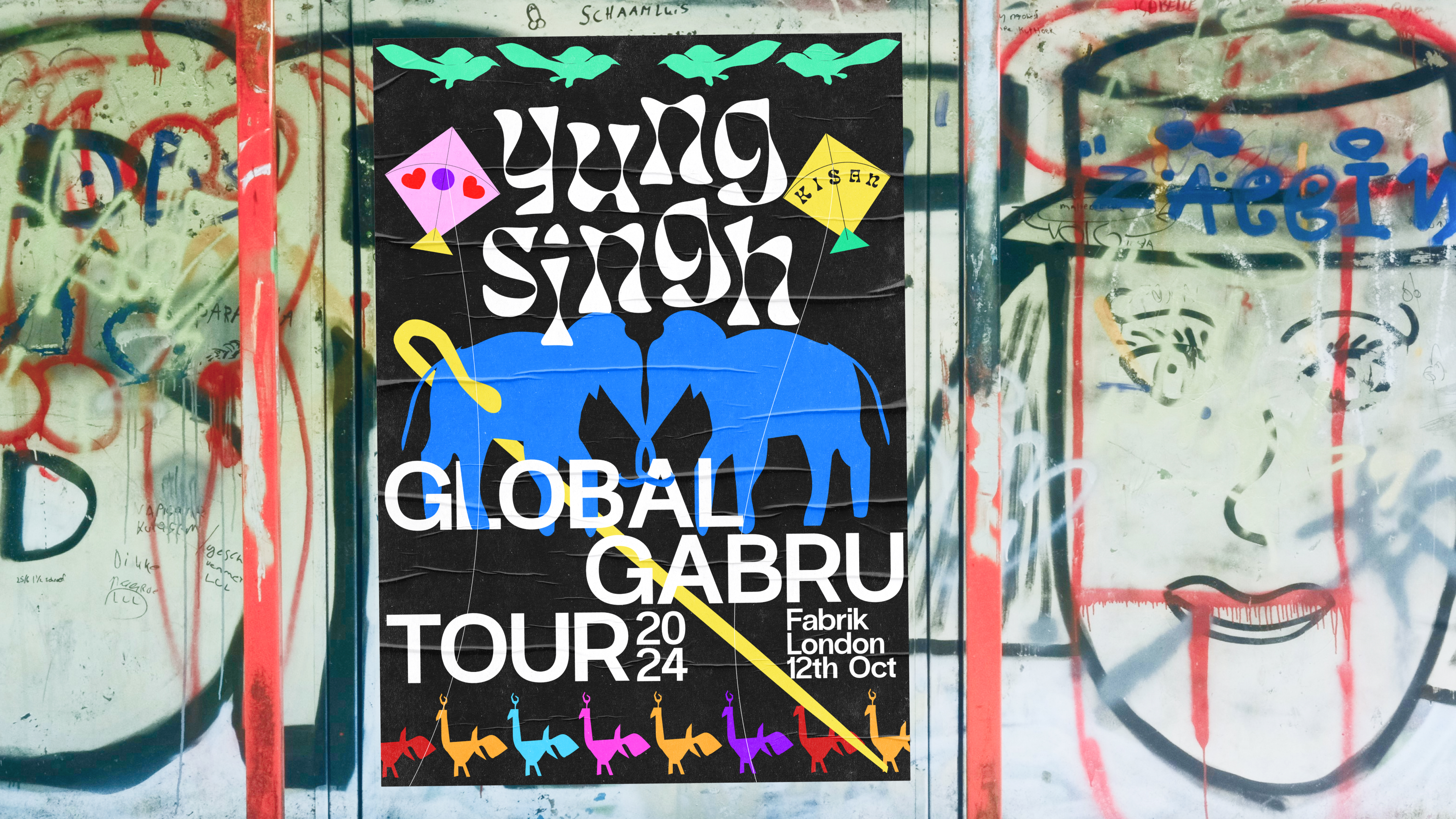
I had the exciting opportunity to collaborate with one of the UK’s top DJs, Yung Singh, on the revitalization of his brand and digital presence. My task was to refresh his existing logotype and develop a cohesive brand identity for his artist website, aligning it with his vision and values.
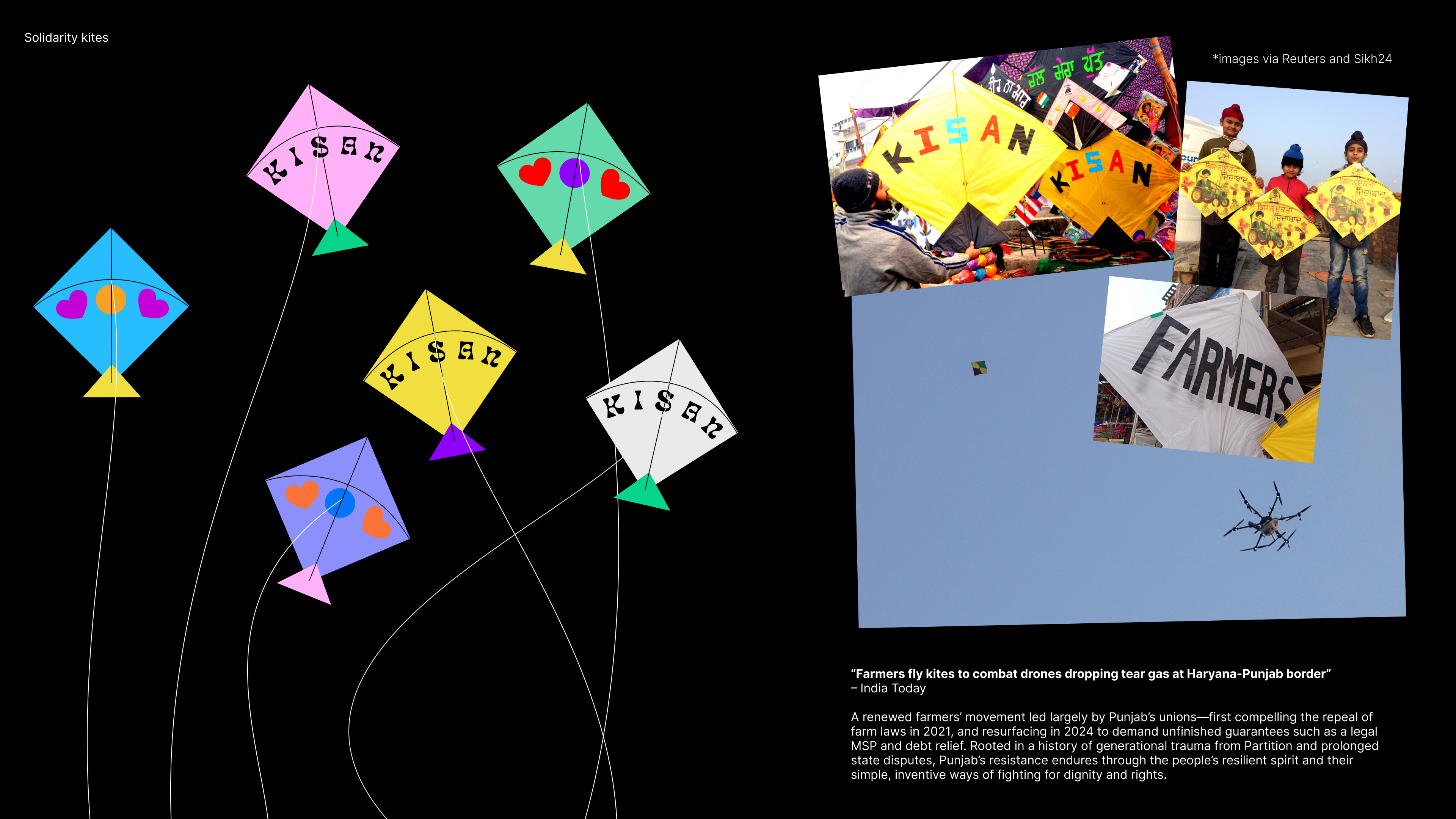
This project allowed me to merge creativity with strategy while drawing on our shared cultural heritage. I took inspiration from the rich textiles, vibrant colors, and the global Punjabi diasporic spirit, creating a platform that is not only visually engaging but also fun, uplifting, and informative.
An important aspect of the project was integrating a dedicated section for resources. Singh wanted a space that would disseminate cultural knowledge and serve as a portal for a holistic overview of various resources, including songs, books, artwork, movies, and more. The goal was to create a space that could educate and inspire, reflecting Singh’s cultural roots while catering to a global audience.
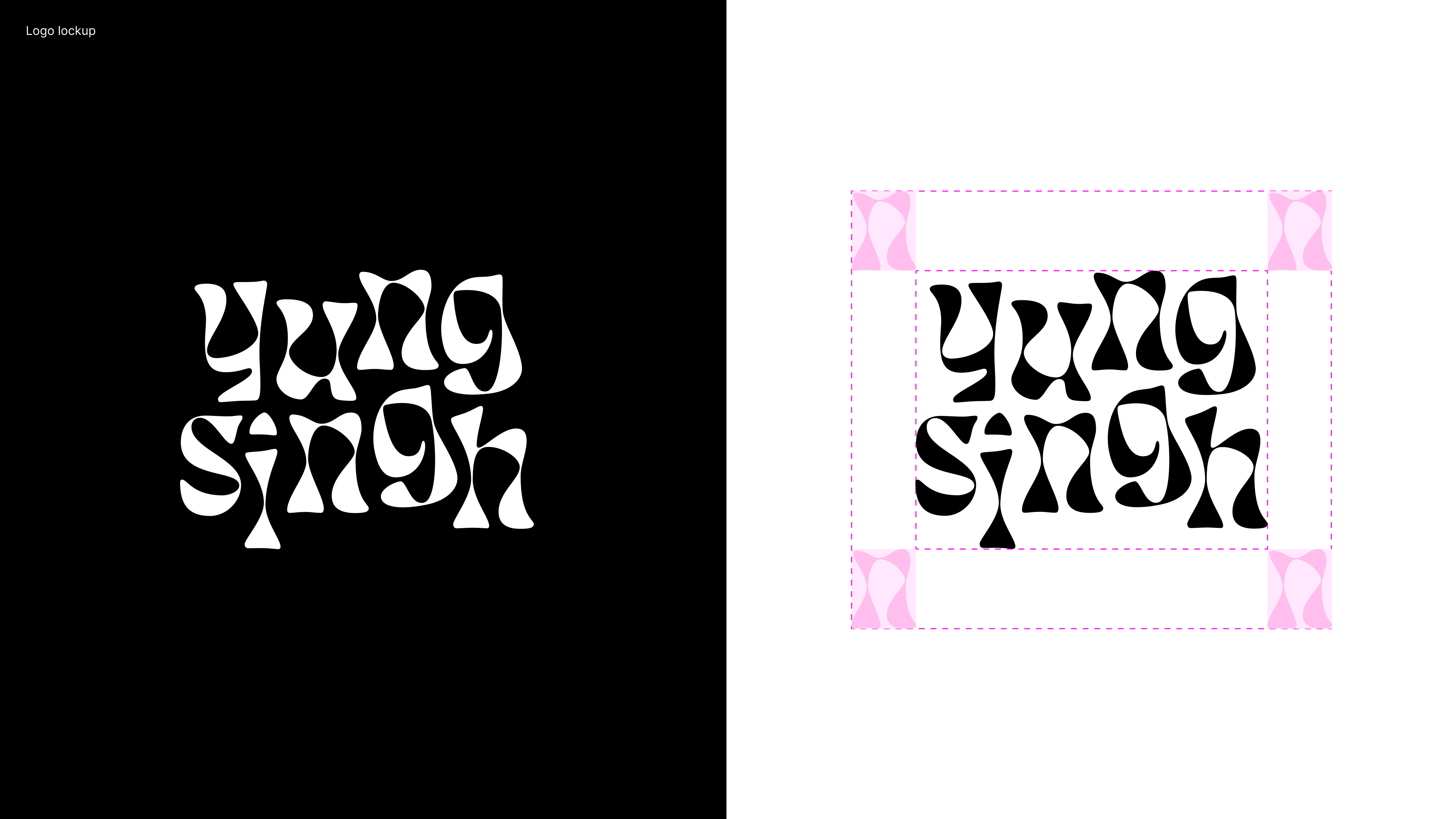
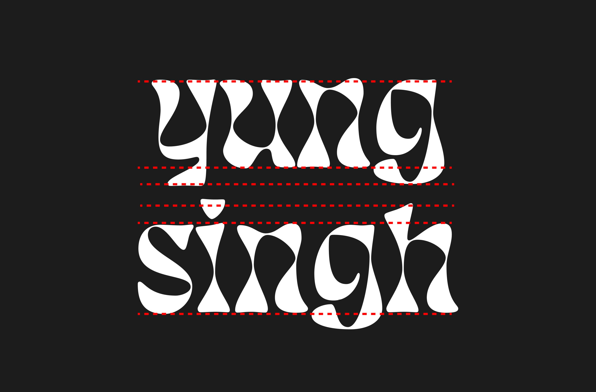
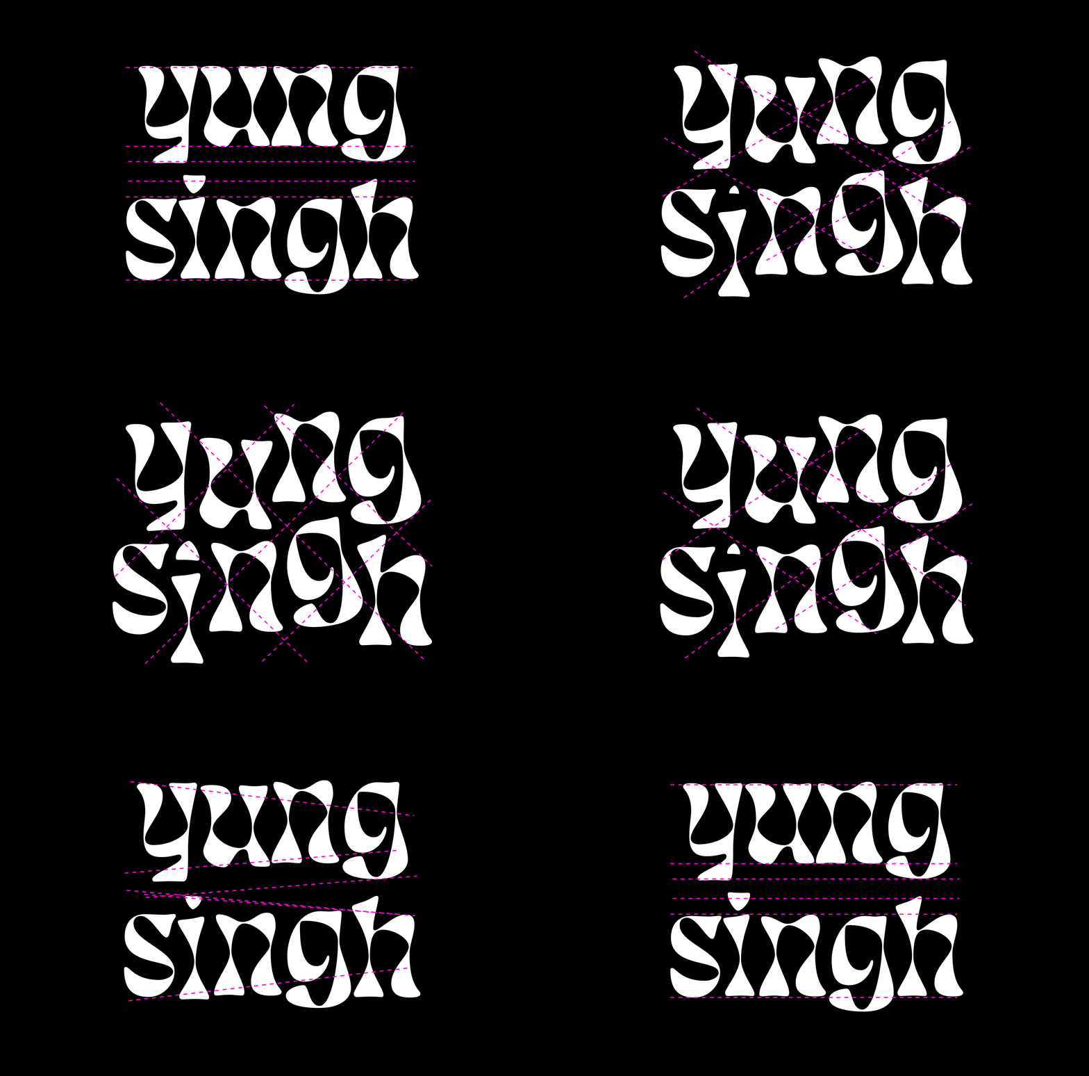
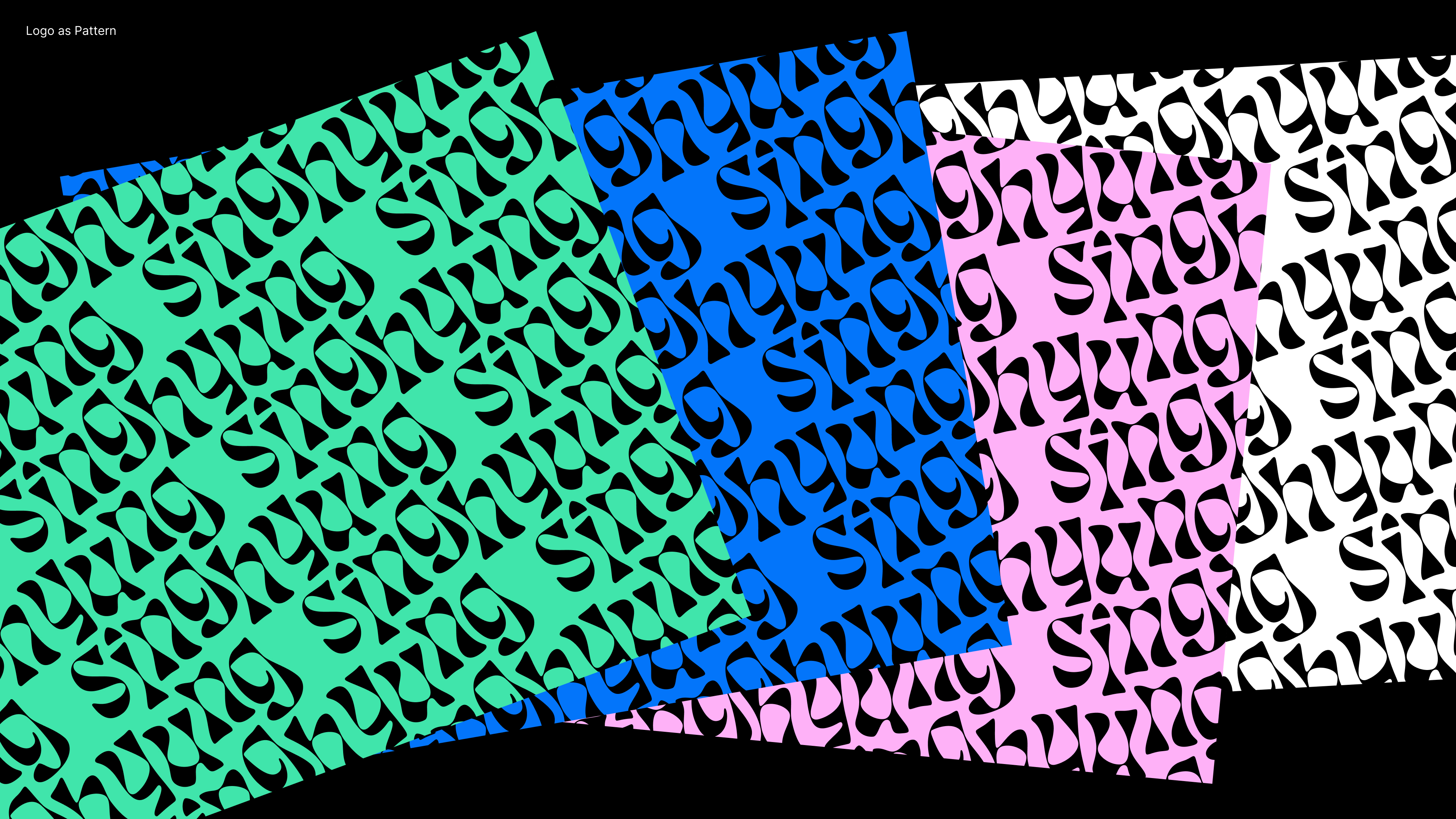
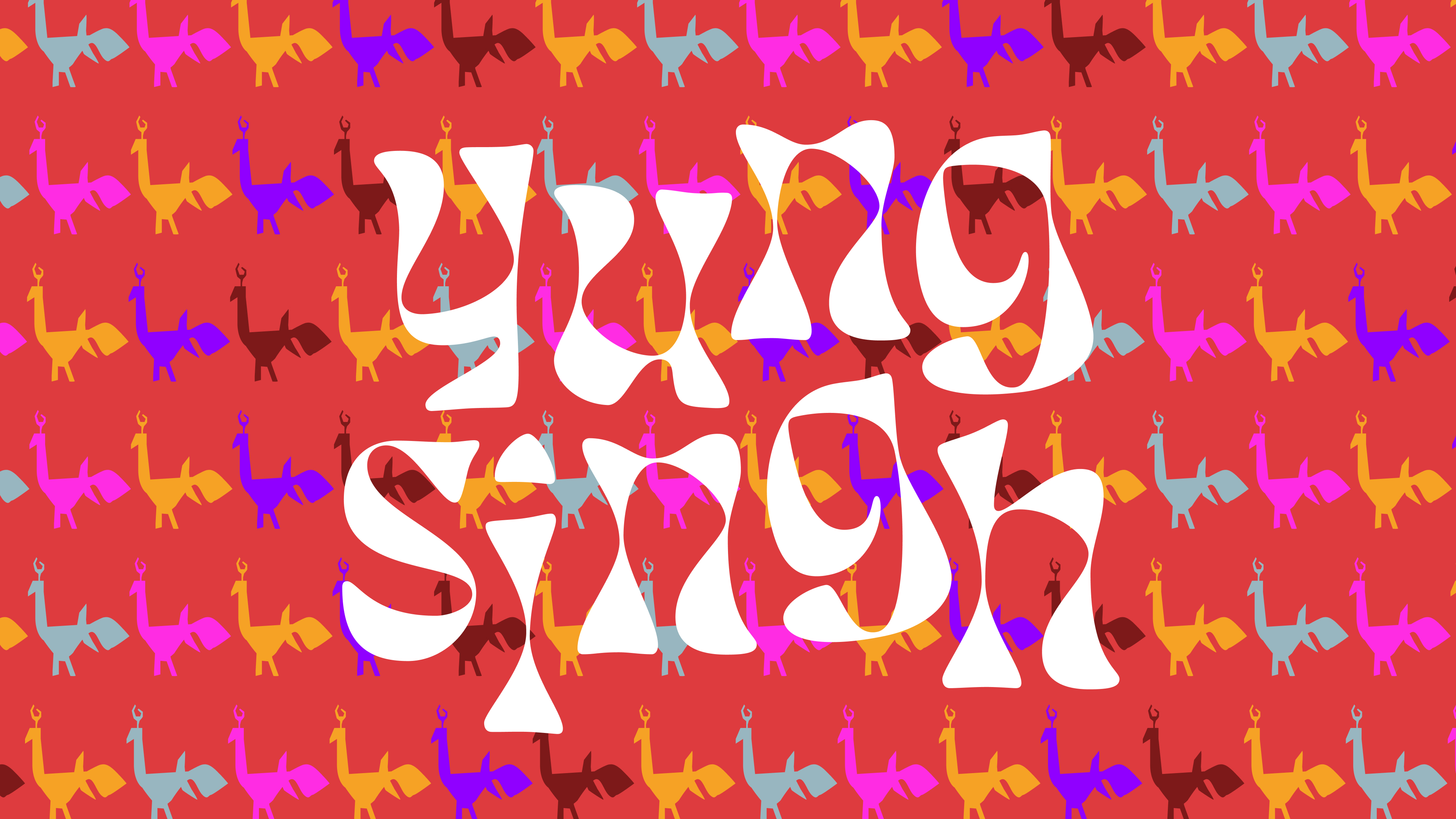
Breaking out of the linearity of the old logotype to enhance the fluid
characteristics of
the existing font; creating a more dynamic unit that better represents the nature of the music and spirit of the artist
Old vs.
New logotype
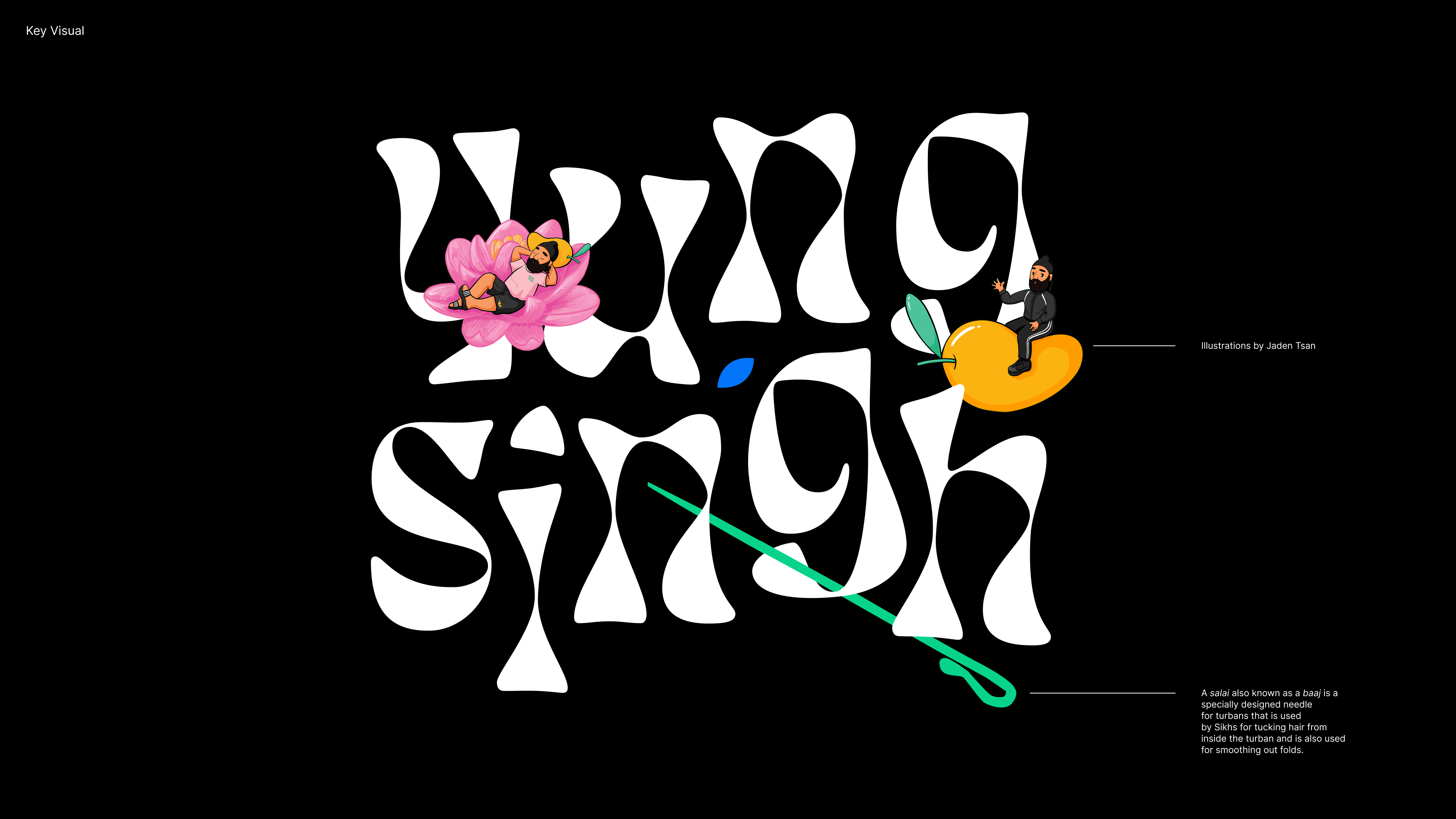
Landing page artwork using existing illustrations created by Jaden Tsan and new brand elements.
Eg: Salai/baaj: A salai (Punjabi: ਸਲਾਈ) also known as a baaj (Punjabi: ਬਾਜ) is a specially-designed needle for turbans that is used by Sikhs for tucking hair from inside the turban and is also used for smoothing out folds.
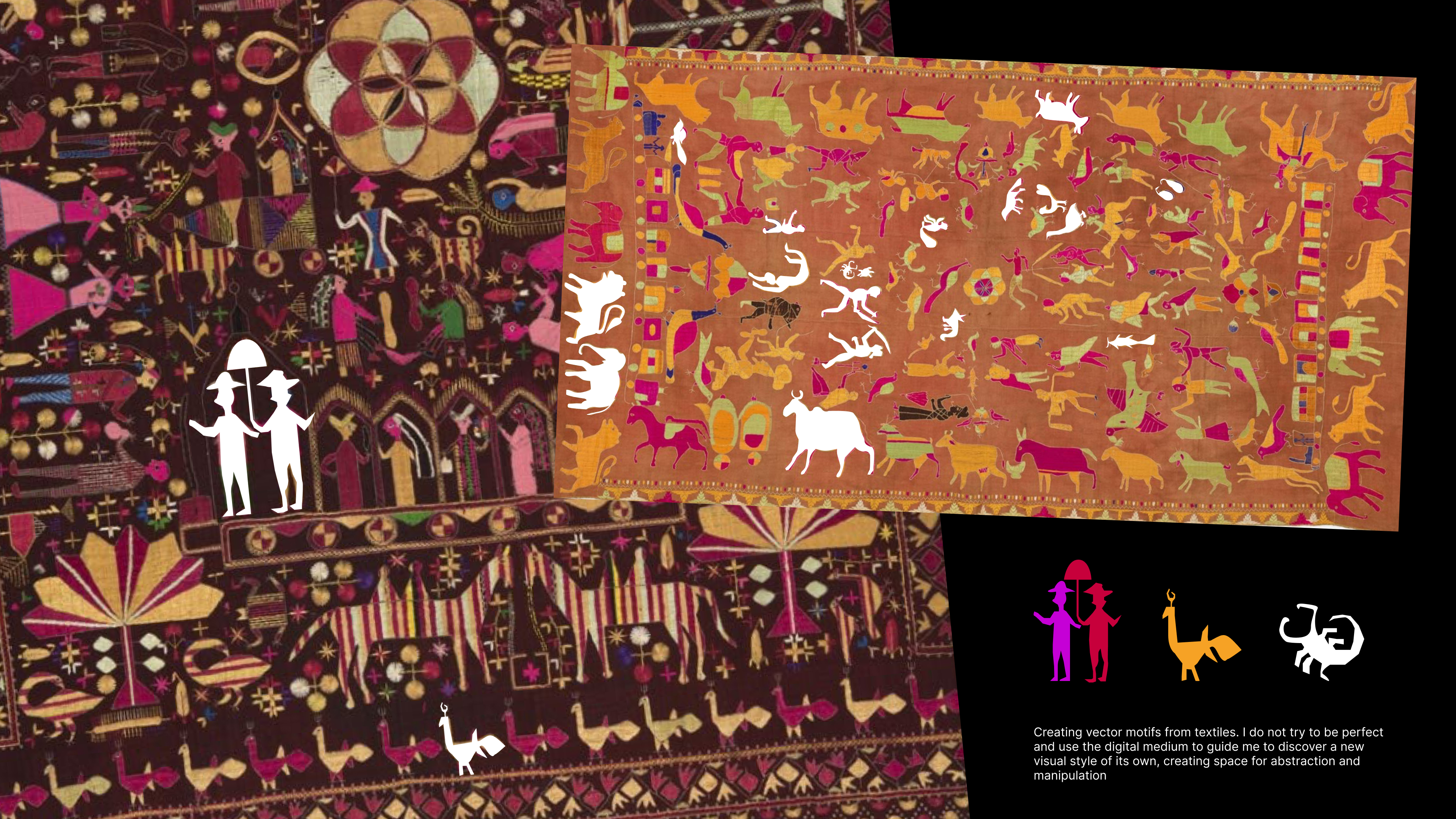
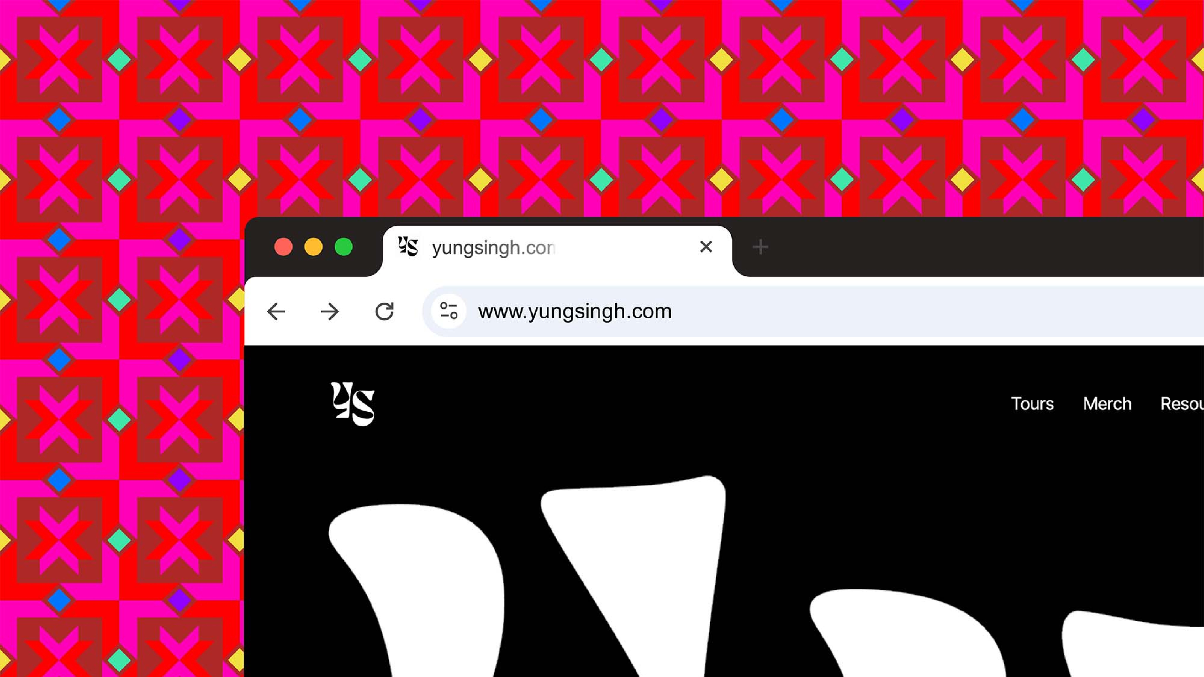
I started my visual research for the brand elements by drawing inspiration from traditional Punjabi textiles, particularly the motifs found in phulkari. This became the foundation for my approach to color, shapes, and contrast.
One challenge I encountered was translating the vibrancy of an analog medium like textile into a digital form. I felt a certain pressure to ‘accurately’ represent the source. However, I wanted to preserve the imperfect, handmade quality of the original motifs. To achieve this, I opted for a method of rapid tracing, allowing the shapes to take on an abstract silhouette with unique qualities, while still reflecting their cultural roots.
Library of motifs